Silent Runner involves a number of media conventions, some that we have used in the general sense and some conventions that we have developed or challenged.
We’ve used conventions of narrative in the sense that we used a linear plot and the structure in the general order in which they are presented to the audience with the exposition of demonstrating the actor is a keen runner going out for what starts out to be a normal run. This is then followed by the development of her entering a secluded forest where she appears to be lost and isolated from society. The complication is when she appears to be being followed unaware to the actress playing the runner but known to the audience. However, a way in which we have challenged the convention of narrative is that we conclude our film during the climax not revealing the resolution of what happens to the runner and her stalker.
 Conventions of camera we used in the process of production were a number of conventional shots used in films to distinguish between different emotions of the film and to concentrate of certain areas of the storyline. For example, we have used a number of long shots to establish setting, used a number of close ups for dramatic effect and used the space in frame and composition to give the essence of symbolic space and isolation.
 Methods in which we challenged this convention were that we have also used a variety of more unusual shots. For example, we have used the Dutch Tilt camera shot to express abnormality in the world and a number of mirror shots as in the opening scene showing our actress getting ready and eye line matches where we show her looking for the source of the snapping twig, which are not as used as much as other camera shots.
Editing conventions that we chose to use was the aspect of continuity editing throughout our film as we follow the course of the actress’s run. We have also used cutting from different angles of the same scene and action which is often used in media productions. To challenge this we broke the eye line match rule in which we showed the actress looking for the source of the snapping twig but deprived the audience of what she was looking at just her reaction to it to give the allure of mystery
Conventions of sound that we used was general sound techniques used in films including soundtracks and sound effects such as the Asynchronous sound of a twig snapping which was not matched by an on screen source which an effect of suspense and drama. We also used a number of Diegetic and Non-diegetic sounds in our original plot idea of a car crash as we added a tire screech and as we were shooting in a forest there was a lot of natural sound too. Our choice of song Massive Attack – Teardrop was chosen to express the feelings and emotions of the actors through the song to substitute the no dialogue. In contrast a way we have challenged this convention is that we have no dialogue throughout our film despite it not being a silent film. Our film mostly consists of soundtracks, ambient sound and natural sound made by our actress like heavy breathing, gasping and screaming.
 Mise en scene in the sense of conventions we mostly used involved, that most of our lighting is natural light like sunlight or moonlight which was used to give atmosphere to match the emotion of the story. An example of this is when the actress appears to be happy then scared, from the start of her run where it is bright and daylight, to the scary climax in darkness. We have used costume and the use of props to illustrate character as in her hobbies and ideals and with the stalker character to express a dark character with the used of dark clothing what you expect from a stalker.
We challenged this convention is the performance of our actress in which her performance was the key storyteller due to the no use of dialogue. Our actress had to portray her emotions and the plot through her performance with the use of facial expression, body language and the use of sounds made by the actress for example her heavy breathing, gasping and screaming. Our film was relatively based on the notion that actions speak louder then words.
How effective is the combination of my main product and ancillary texts?
In our poster we wanted to establish a brand identity for our film, we attempted to do this through our use of image, language and design in our poster to portray our film as a certain genre.
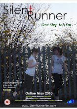
The way in which we used image successfully to create a brand identity for the film is the use of separate images of our actress. With one being more pale then the other and with one looking back at the other unaware that she’s there gives an essence of paranormal and eeriness about it expressing to the audience that this film will either be a thriller or horror. Also the use of bars in the image represents a sense of entrapment and anxiety. The use of nature in the images also gives a sense of isolation in which there appears to be no sign of society.
 The use of language to create a brand identity successfully was portrayed mostly from the tagline of “One Step Too Far”. The use of this tagline presents to the audience a feeling of danger and apprehension. It expresses to the audience a sense of the storyline that the runner may run into trouble and may enter a place she is forbidden to go to. Also the use of the title “Silent Runner” also represents a mood of danger, that something ay happen to the runner; it gives the essence of death with the word silent.
The use of design to create a brand identity successfully was shown through the use of green and yellow text to illustrate the use of nature as key to our story. This represents to the audience the importance of nature and the way this isolates her from society and enhances the sense of fear. Also the use of the red T that looks like a crucifix suggest the genre of horror, it suggest to the audience that their may be blood or murder, the use of red suggest danger accumulated with the cross gives a sense of evil. Our poster was designed to give a sense of mystery/wonder as it wasn’t fully explicit what would happen.

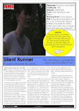
The way in which the contents of a magazine feature the audiences understanding of our film is the use of image in the magazine review and the language. The use of the image in helping the audience in the understanding of our film is that it firstly indicates the genre/brand of our film as it shows our actress in a hysterical state in a dark forest which basically screams thriller. The use of image also suggest to the audience a sample of the storyline as the image suggest a sense of danger that she is trying to get away from something and maybe not succeeding. The image of the main character also states who to focus on when viewing the film.
The use of language that helps the audience in the understanding of our film is that it firstly states the plot which shows the audience a brief outline of our story to perhaps grip the reader into being interested in viewing the film or reading the rest of the review. The language also illustrates that it is not a professionally produced film which may deter some audience members. As our target audience is relatively a young mature audience of 14 – 25 of both genders. As it is a negative review of the film which does state some good points on editing and production it helps the audience to understand that it is not a blockbuster. It presents to the audience that it is an interesting piece if you are interested in amateur media production.
What Have I Learned From My Audience Feedback?
The way I constructed my audience feedback was issuing out questionnaires that ask my audiences members a number of questions about our film. We also asked them to add comments about our film, some more specific than other to get their viewpoint of our film to find either fault or praise.
Our audience sample consisted of a vast majority of young and old students plus some teachers and other adult members of society. Our audience was mostly an opportunity sample that consisted of an even ratio of boys to girls.
A question we asked to our audience was what genre they thought was portrayed from our film. As you can see the majority of our audience members correctly guessed the correct genre of our film showing that our film had good representation.
We also asked our audience members if they could understand the storyline in which we wanted to find from our audience feedback if our film was confusing and needed filling or re-shooting.

You can also see from this pie chart that the vast majority understood our film, showing that our film has good structure and not in need in redrafting.
Also a number of our audience members made some praising comments such as “A good suspense which made it exciting and enjoyable to watch”. Some of our audience members also requested a sequel as our film was inconclusive they were griped so much to the actors and storyline they wanted closure which expresses that they rather enjoyed our short film.
Our audience members also commented on some of the technical aspects of our film. A lot of members of our film found that when the music started when the actress put on her earphones was effective. Also a few of our audience members found the hand held camera movement to illustrate the creeping movement of the stalker was gripping, effective and added to the atmosphere.
We lastly on our questionnaire asked our audience members to rate our film based on their own experience of viewing the film.
 Where as you can see our film got great reviews from our audience members as they believed our film was better than average and felt that it was more than just good. Our audience members were shown other short films to allow them to make comparisons which make the results from our audience feedback even more pleasing.
Our overall conclusion of our audience feedback was exemplary we believed that were honest about there opinions and there evaluations of our product gave us ideas and inspiration to improve and add to our production. As a result we believe that if given the time we would produce more editing to our music such as lapses in the music or add a second soundtrack which was the only aspect proposed from our audience to alter.
How did you use media technologies in the construction and research, planning and evaluation stages?
The software used to produce our short film media product was Adobe Premiere which allowed us to edit our production of the film. Using such software presents its own advantages and disadvantages. The advantage of editing our product on this software is that it allowed easy configuration of our short film and presents itself in an organised fashion that is simple to interpret. Also as it allowed simple editing techniques to be produced it allowed a fast procedure of editing as in the chase scenes of our film when the runner is escaping the stalker. This software also allowed us to create credits which some editing software does not. The main advantage of using this particular software was that it allowed a lot of aspects of our film to be altered and improved including a wide range of cutting techniques and visual effects. The software also allowed us to alter (increase or decrease) the shade, length and pace of the shots in our film. We also could edit the music throughout the film in the same way by changing the pace of the music to illustrate scenes of tentatively or excitement as in the chase scenes where we would increase the pace and volume of the music and during the scene of the runner hiding behind the tree we lowered the volume of the music to emphasis the desire to go undetected.

However the use of Adobe Premiere’s editing software did bring some disadvantages as it did not allow us to edit two parts of our film separately on two computers simultaneously which did create some timing issues and inconvenience as not all members of team could edit. Also some aspects of the software were too basic and did not allow us to use advance editing techniques. This would have been useful in our original storyline of a car crash which was difficult to film and produce using our current filming equipment and software which resulted in our change of storyline. There were also in our group a lot of technical faults, for example there were issues of updating in which the latest edited version from my partners computer did not update into mine. There were also an issue of conjoining two separately saved scenes into one adobe file which luckily we detected early as we did lose some of our work which in turn caused more time issues. The main disadvantage of using Adobe Premiere we found was its complexity as some aspects of the software were not visually acceptable and therefore difficult to understand and use for newcomers which was resolved once we got use to the software.
The software we used to present our processes of making our media product is a Blog on http://www.blogger.com/ using such software brings its own advantages and disadvantages. The advantage of presenting our work on a Blog was that it allowed us to easily present our work as a group. It also allows us to visually present our work in the form of images and videos which separates the text in the Blog making it easier, faster and more enjoyable to read. Using a Blog also allows us to explain our planning, production and evaluation is a Diary explanation form, it allows us to keep an organised track of our work and allows easy explanation and recall. Also using the website http://www.blogger.com/ allowed us to look over other blogs for inspiration and advance our creativity.
However the use of Blog software did not allow us to alter the Blog space it does not allows us too much freedom in customizing the layout of the Blog which has become apparent when uploading YouTube videos as due to the narrow column some particular type’s of video does not fit in the space provided. This lack of space did limit our creativity as we couldn’t apply a layout design as we are constricted to single column, this also limited us to a straight and narrow design as it didn’t allow slanted boxes, boxes of other shapes and animation schemes. Also representing you work on a Blog requires you to be precise and to the point, it doesn’t allow you to be explanatory and in depth which may come natural to some writers. Another disadvantage of using a Blog is that as in a traditional Blog, although structured chronologically, the newest entry appears first and the oldest last which can long term effect the intended order of posts which can result in those unfamiliar with the concept may become confused and unable to navigate around it.
 During the filming procedure we encountered a number of setbacks. A number of setbacks were due to the shooting schedule, although we did have a shooting schedule there were often changes made to it which sometimes affected our filming process. After we made our initial schedule we then had to change our actress because of conflicting agendas. Which resulted in us acting the roles. This set us back as we had not prepared to act the roles ourselves as we wanted to concentrate on the aspects of the film behind the camera. Following the loss of our actress we then lost a fellow member of the group due to a lack of participation on there part, this also created further obstacles and strain on our shooting schedule as we then had to re-arrange how we were to film the film as both us remaining members were also the actors in the film.
 The editing process also involved altering scenes brightness in order to make them darker to suit the theme of the scene such as scary scenes. Other aspects of the film we could edit was the pace of the film which we chose not to do and the addition of our music track Teardrop by Massive Attack which we could then further manipulate to become either more louder or more quite to add effect to dramatic moments.